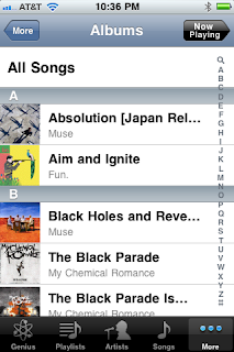
Thumbnail List
One of the most instantly recognizable ways to display information is in a thumbnail list. This is often used with media or news items, where an image is displayed next to a caption describing the article or video that can be reached by clicking on each item. Here are two examples, one from the iTunes app and the other from the older YouTube app.
 |
| iTunes |
 |
| YouTube |
Grid
4ourth describes this pattern as "a set of tiles." Usually when we see this pattern, we see bordered squares, as in the example on the left from the iPhone's Photos app. However, Doodle Devil makes clever use of this pattern, arranging borderless, clickable icons into a grid:
 |
| Photos |
 |
| Doodle Devil |
Awesome Allison, you give such detailed information. Keep up the good work
ReplyDeleteGreat work. My only minor niggle would be that ideally you'd have mentioned that these are all patterns in the broader "Display of Information" category - which you did link to, but didn't mention by name ...
ReplyDeleteThanks Avery!
ReplyDeleteAs long as I can keep the niggling minor, I think I'll be on the right track ;) Thanks for the feedback!