Monday, February 25, 2013

Heuristic Evaluation

This week, I had the pleasure of meeting up with the author of Steve's Mobile Blog to exchange evaluations of each other's prototypes. According to the assignment, we were to assess the prototypes based on ten categories, as outlined by Scott Klemmer in his class on Human-Computer Interaction, which you can find here. Additionally, for each issue discovered, a severity rating was to be assigned in-accordance-with standards set forth by the Nielsen Norman Group. After sitting with Steve, I found the following potential issues with his prototype:

I think the idea of drawing the list of available locations for review from places where they have already "checked-in" severely limits the user. Supposing the user does not use the "check-in" feature available in some other apps, this would then be rendered useless for the individual. The flexibility and efficiency category is thus violated. Since the app will still function without changing this, I gave a severity rating of 1.

There were multiple screens in which there was no way to go back to a previous screen. Unfortunately, users often make mistakes. In order to allow better user control and freedom, I recommend adding functionality to return to the menu and/or previous screens. While this will not cause the app to break, it can leave a user quite frustrated at the inability to quickly access the desired functionality. Therefore, I gave this a severity rating of 4.

I encountered some confusing functionality when landing on the "location selection" page. Swiping left was supposed to give one option, while swiping right presented a different option. In order to minimize the learning curve and increase recognition over recall, I recommend changing to use a single swipe to either revel buttons with the desired options or reveal a deeper level with multiple options. Again, this would not break the app, and although it has a steeper learning curve, it is not going to prevent users from accessing all features. The severity rating for this issue is 2.

Finally, I recommend a complete revamping of the "rating" page in pursuit of an aesthetic and minimalist design. I have broken this down into several categories:


  • The existence of both a "title" and a "comment" field seems extraneous. The goal of the app is to allow quick reviews, but having multiple editable text fields, even if they are not required fields, causes the user to think they must fill out the form completely before submission. I recommend reducing this to a single editable text field for comments.
  • In order to streamline the process, I would also allow for rating in categories, such as "cleanliness," "service," etc. That would allow a single tap to imply commentary, thus reducing the amount of time spent typing in the text field.
These changes are also merely cosmetic issues, thus rendering a severity rating of 1.


Overall, I think Steve has a great design, and I look forward to seeing the final product!

Monday, February 18, 2013

Storyboards and Prototypes

Point of View
This week we were asked to consider applications that fit a certain point of view. In my own personal life, I am attempting to go paperless, so that was the driving force behind the apps I chose to storyboard. This fits in very well with the digital age. Whether it's saving trees, saving money, or just being in a place where you don't have paper, a mobile app can come in handy!

Storyboard
Paperless Fitness
A few years back, I was following the workouts from the CrossFit website regularly. I would log onto the website, write down the workout of the day as well as my previous stats for that workout, go to the gym, record my stats for the week, then go back to my computer to enter my new stats into my digital record. This was an incredibly inefficient, but it worked at the time. The following storyboard depicts an idea for an app that takes care of that whole process.

Paperless Scoring
When visiting my family over Christmas, we played cards or dominoes every night. I have always been the one to keep score, but this year my sister wanted to take care of that. Unfortunately, she could use a little brush-up on her basic math skills! Additionally, the notepad my parents had handy would not hold an entire game, so we had to flip the paper over mid-game, and hope the sleepy scorekeeper would record everything correctly. Here is the storyboard for an app to solve the paper and math problems.

Prototypes
I selected the scoring app for my prototypes. The first model I built was what I initially believed would be closer to what I would ultimately construct, but after designing my second model, I found some problems with the first one.
Model 1


Model 2

Finally, if you would like to see the prototypes in action, here is a video demonstration and self-critique. Until next time...

Monday, February 11, 2013

No use listening to shoutcasting if you can't hear what's going on with team Dignitas!

If that title has you utterly confused, you're not alone. Several months ago, I would have felt the same way. But relationships have a way of changing our interests, or at a minimum, our knowledge-base. Our assignment this week followed in a similar vein. Continue reading to find out what I mean...

The Mission
Observe two individuals participating in an activity. Document observed "successes, breakdowns, and latent opportunities" relating to the use or lack of mobile devices. Interview individuals and look for inspiration.

The Match
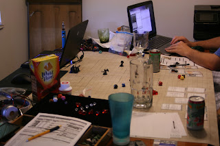
As I mentioned above, relationships can expand our horizons. For this event, I chose to observe a group of friends playing Dungeons & Dragons, something with which I have absolutely zero experience! I was "fortunate" enough to have also been observing their session the previous week, which enabled me to focus my thoughts and questioning for this event. Here are some of the observations I had, as well as the input from my participants about opportunities to turn break-downs into successes!

Nihil Dice Roller


The Noob
1. Breakdown: too new to have his own dice
    Success #1: used a virtual dice roller
    Success #2: late friend arrived and brought entire bag of dice!
2. Breakdown: unfamiliar with rules/character options
    Success: printed "baseball cards" for each skill
    Latent opportunity: virtualize these cards
"The Noob" finally got his dice
Mr. Tardy
3. Breakdown: didn't show up on time
    Success: DM played his character for him
4. Breakdown: argumentative, disputes rules
    Success: What DM says stands

The Almighty (Dungeon Master)
5. Breakdown: members didn't show up on time (yep - this one affected had multiple     effects)
    Success: tailored game on-the-spot to fit current characters
6. Breakdown: difficulty in keeping track of non-player characters
    Latent opportunity: character portfolio
7. Breakdown: difficulty keeping track of initiative order
    Success: representative tokens placed in order after initiative roll
8. Breakdown: has to re-draw map for each battle
    Latent opportunity: virtual game board
9. Breakdown: monsters must be tailored for each battle, can be hard for new DM
    Latent opportunity: monster generator
DM must redraw this map for every battle
The Crowd
10. Breakdown: players got hungry!
    Latent opportunity: ping the girlfriend - can she bring food? (saves delivery charge)
11. Breakdown: splitting the food bill
    Latent opportunity: restaurant can charge multiple cards rather than a single one for delivery items
12. Breakdown: table does not have room for much growth
    Latent opportunity: each player has virtual machine with stats, abilities, etc.
13. Breakdown: can't see teammates' stats
    Latent opportunity: big scoreboard on the wall (whiteboard suffices)
14. Breakdown: week 1, there was no mat
    Success: borrowed pieces from another table top game - sufficed, but ordered mat, arrived for week 2
15. Breakdown: difficulty keeping track of status
    Success: borrowed runes from "Ascension" game to visualize more quickly

The Muses
This game, mentioned in item 15, has been converted into an app for the iPhone. The designers for this did a wonderful job with their layout. They essentially use thumbnails grouped into sections according to the card's type. And despite the overwhelming amount of information displayed on the screen, they have still managed to achieve the look of a board game. While there are many takeaways from this app, the main one I notice is the ability to keep information concise and organized. 
Star Wars Soundtrack
Any epic adventure needs a soundtrack that is just as epic! While a D&D scoreboard may not need a fully fleshed-out feature-length soundtrack, the music and sounds included need to fit the app. They should augment the experience, not annoy the user.
I cannot imagine my childhood without Legos. The way these toys fit together with each other is just incredible, isn't it!? I think a well-designed app will be the same, in that the components will complement each other, they will build off each other.
Bullseye
An app does not need to be a "one-size fits all" product, but should be tailored for the target audience. If designing an app that times children brushing their teeth, the app should be simple enough for a child to use. This concept should encompass everything from aesthetics/color choice to functionality to word choice. Keeping the target audience as center focus will help designers hit the elusive "bullseye."
And now we have come full-circle. The quote in this blog's title is the first thing I heard when my boyfriend walked in the door tonight. It references his excitement of watching the webcast ("shoutcast") of the North American Qualifier Tournament of this game. The popularity of the game is astounding! With an average of 12-million players daily from around the world, a designer considering League of Legends has to be thinking, "What keeps them coming back?" A good app will not be a "one-hit wonder" but will welcome the user to continue the experience over and over. 

And speaking of coming back, remember to stop by again next week for a closer look at native apps! In the meantime, if you would like to hear a few ways to improve the spa experience with mobile devices, I have made a short video: Mobile Devices at the Spa

Monday, February 4, 2013

Revealing the Design

The Concept
This week I began brainstorming about my first app. Our professor, Dr. Joseph, suggested we build an app to be used while waiting in line. I began by throwing out a list of potential apps I (or my awesome friends) might use. Some of these are a little far-fetched, and some already exist, but we all have to start with a few ideas, right? Well, here's what I came up with:

Waiting in Line
1-Design army for Warhammer 40K
2-Where did I park?
3-Find my friend
4-Mini exercise challenge
5-Photo scavenger hunt
6-Mad lib
7-Look at boobs
8-D&D character builder
9-Appointment scheduler
10-Order pizza (or...any carryout/delivery)
11-Solve a Rubik's cube
12-Check all bank accounts
13-Learn morse code
14-Write a haiku
15-Spy on babysitter/daycare
16-Message to future self
17-Who's that hottie in line over there? (facial recognition, location identifiers)
18-Hidden pictures
19-Read my daily mantra/horoscope
20-Build dance playlist

Prototypes
In narrowing this down to focus my efforts, I selected two apps to prototype. Let me describe them in just a bit more detail.

Photo Scavenger Hunt – This is where users have a list of items to search for in the world around them and capture with their phone's camera. Here are the photos of the mockup for this one:

40K Army Builder – This app allows the user to compile an army list for Warhammer 40K, which they can then save and view later. ...and the prototype photos:


User Testing
Which prototype did I decide to test? I opted for the Photo Scavenger Hunt for several reasons. First, it would take a lot more research to build the 40K app than I feel ready to invest at the present time. The coding would be quite intensive! Also, I believe the photo app would have a wider appeal. I ended up getting sick this weekend, and instead of spreading germs throughout the local stores, I decided to test my prototype from home. This began by testing with my two roommates, followed by three Skype buddies I happened to catch pre- and post-Super Bowl. Here is a screen capture from the Skype testing.


The feedback helped a lot. During one session, it became apparent I needed to add confirmation of a photo saving to a list, which I did, and is included in the above snapshot. And while I had originally intended to only allow one-two lists at a time, another user wanted to be involved in a much higher number of lists. It was recommended for the future to add in functionality allowing users to share the albums (which was something I had already considered, but wanted to keep this simple). I also want to eventually add in functionality to support several things such as company-sponsored lists (maybe even with prizes!?), badge-earning (number of lists completed, 15 votes for an album, chart-topping album), etc. But for now, simple is the key.

Sunday, February 3, 2013

Off to the Races!


There are several ways to approach the start of building a mobile application. You can either get the equipment first, or you can draft the concept. Since my intended audience consists of iPhone users, I am going to be using Xcode, which can be downloaded at no charge from the Apple app store. Just a note, at this time, you must be running OS X 10.7.4 or later. As I was running an older version, this did require an OS update - I went ahead and purchased "OS Mountain Lion," costing $20. I am relatively pleased with the update. Once my OS was compliant, I was able to download Xcode. Here is a screenshot of the simulator up-and-running!