Alas, there comes a time in the lifecycle of all software, when the project must be tested. Keeping the test in mind while building a project can help a programmer ward off potential pitfalls throughout the process, so it is important to begin thinking about testing early, even during the design process.
Since Martin and I have decided to build a web app, we will have the option to utilize two types of testing. The first method will involve inviting friends to test the app on our own individual devices (that is, Martin's phone and my phone). This will act as a pilot study, pointing out any major flaws in usability.
Once we have finished the pilot study, we will progress to larger-scale testing. This will be done by soliciting feedback on a shared version of our app that can be run on a mobile emulator.
We will look at the following things when we conduct testing:
-Does the app fail?
-How long does the average user spend in the app?
-In which areas of the app does the user spend the most time?
In addition to the above objective questions, which will be measured behind-the-scenes, we will solicit the following subjective material, to be rated on a scale to be defined for the user:
-How difficult was the app to learn?
-How much would you pay for this app?
and open-ended questions:
-What additional functionality would you like to see added to this app?
-Did anything bother you about this app?
The questions asked of the testers will be submitted anonymously through SurveyMonkey. Those are my suggestions, and now I turn it over to Martin for further comment...
Tuesday, March 26, 2013
I See a Pattern - Part 2
This week, I will be sharing with you some more examples of patterns related to the way in which information can be displayed on a mobile app. These patterns fall under categories laid out by the 4ourth mobile patterns wiki.
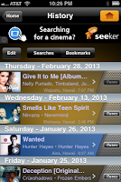
Thumbnail List
One of the most instantly recognizable ways to display information is in a thumbnail list. This is often used with media or news items, where an image is displayed next to a caption describing the article or video that can be reached by clicking on each item. Here are two examples, one from the iTunes app and the other from the older YouTube app.
Grid
4ourth describes this pattern as "a set of tiles." Usually when we see this pattern, we see bordered squares, as in the example on the left from the iPhone's Photos app. However, Doodle Devil makes clever use of this pattern, arranging borderless, clickable icons into a grid:
Thumbnail List
One of the most instantly recognizable ways to display information is in a thumbnail list. This is often used with media or news items, where an image is displayed next to a caption describing the article or video that can be reached by clicking on each item. Here are two examples, one from the iTunes app and the other from the older YouTube app.
 |
| iTunes |
 |
| YouTube |
Grid
4ourth describes this pattern as "a set of tiles." Usually when we see this pattern, we see bordered squares, as in the example on the left from the iPhone's Photos app. However, Doodle Devil makes clever use of this pattern, arranging borderless, clickable icons into a grid:
 |
| Photos |
 |
| Doodle Devil |
Tuesday, March 19, 2013
Implementation Strategy
Since Martin and I have teamed up, I now have to keep in mind there are two of us working on the same app. Therefore, in my implementation strategy, I want to ensure I build foundational material first, allowing Martin to test. We are going to meet up this coming Saturday to discuss our plan a little more in-depth, but for now, this is my tentative idea of how the rest of the semester will progress:
During Spring Break, I will personally be working through some of the optional assignments I have not completed in this class, as well as working my way through the iOS programming class offered free through Stanford on iTunes.
The first week of April will be focused on building the basic navigational structure, which will allow the user to move from screen to screen through the app. This will lay a foreground and allow Martin to design any background images to fit around the data.
During week 2, I will work on telling the app how to populate the "Read" screen. This will utilize persistent data...which means I'll have to learn about how to utilize that capability.
The following week, I will add functionality for the "Create" screen. This is how we will be able to grow our data - through user submissions.
The final piece of the puzzle will be the "Save" or "Favorites" capabilities. This will build upon both the "Read" and "Create" functionalities, so it is pertinent to have them completed first.
And this brings us to May, which means final testing and publishing. We will also use this time to beef up our joke database so users have something to start with immediately upon using the app.
The MVP for this will be incredibly basic, but possible future enhancement ideas include log-in and sharing capabilities, adjustable settings, as well as a rating system.
Monday, March 18, 2013
I See a Pattern
For anyone beginning to work on the design portion of their app, there is a fantastic site for mobile patterns at 4ourth mobile patterns wiki. In looking through the composition section of the site, there are a few areas where there are no examples. This week's post fills in a few of those gaps. (Note: All screenshots taken on iPhone).
Scroll

The first category listed for design consideration is the way in which an application scrolls through items or screens. This picture from my "Contacts" menu shows how they allow you to jump through the scrollbar by clicking on a letter of the alphabet.

This screenshot shows an indicator bar at the bottom, letting me know how far I have scrolled through my photos.

And this one shows the "filmstrip" method of scrolling, which is my favorite. The indicator bar is a series of dots at the bottom. I enjoy this method because it provides information while being very nonintrusive.
Advertising

I also feel it extremely important to address advertisements. Some developers will insert ads into the app as a "gate" of sorts, through which you must pass in order to get to where you are going, in much the same way as commercials appear on TV. You have to sit through them in order to watch the next portion of the show. Here is one such ad from Mr. Giggle.

For those that need ad support in order to fund their app, there are much better ways to integrate ads into the software. In this example, the company mobileDELUXE has place a clickable "thank you" at the bottom of the screen, which takes you to their company website.
An even better example of seamless integration is this screenshot from SoundHound. After identifying the song you are listening to, it offers the opportunity to purchase that song on iTunes.
Overall, a better choice for any app is one that is smooth and seamless. Intrusive ads can prevent a user from enjoying an app and sometimes will even cause a user to cease and search out a different app, even for a price.
Scroll

The first category listed for design consideration is the way in which an application scrolls through items or screens. This picture from my "Contacts" menu shows how they allow you to jump through the scrollbar by clicking on a letter of the alphabet.

This screenshot shows an indicator bar at the bottom, letting me know how far I have scrolled through my photos.

And this one shows the "filmstrip" method of scrolling, which is my favorite. The indicator bar is a series of dots at the bottom. I enjoy this method because it provides information while being very nonintrusive.
Advertising

I also feel it extremely important to address advertisements. Some developers will insert ads into the app as a "gate" of sorts, through which you must pass in order to get to where you are going, in much the same way as commercials appear on TV. You have to sit through them in order to watch the next portion of the show. Here is one such ad from Mr. Giggle.

For those that need ad support in order to fund their app, there are much better ways to integrate ads into the software. In this example, the company mobileDELUXE has place a clickable "thank you" at the bottom of the screen, which takes you to their company website.

An even better example of seamless integration is this screenshot from SoundHound. After identifying the song you are listening to, it offers the opportunity to purchase that song on iTunes.
Overall, a better choice for any app is one that is smooth and seamless. Intrusive ads can prevent a user from enjoying an app and sometimes will even cause a user to cease and search out a different app, even for a price.
Sunday, March 17, 2013
Heuristic Evaluation - Part 3
This week, I will be giving some feedback to Martin Watts on his prototype for a joke application. If you are interested, you can view his prototype on his blog. Martin and I will be working together throughout the rest of the semester as a programmer/designer pair to develop an app. Without further adieu...
Consistency and Standards
Severity Rating: 2
The biggest issue I noticed with the "Joke Around" app was the idea of "saved" jokes. Here, the word "save" seems a little out of context. Instead of using "Save," I would use "Add to Favorites" and change the "Saved" tab to "Favorites."
Aesthetic and Minimalist Design
Severity Rating: 1
The "Read" page has a lot more information on it than I think will fit onto the screen of a mobile device. Once you begin designing, I'm sure this will work itself out.
Error Prevention
Severity Rating: 2
When entering a new joke, I would recommend a "preview" before it saves it to the system.
Also, specifically for Martin: it has been a while since I have used android, and since you were designing with that in-mind, I am not sure about the design. Specifically, I am talking about the navigation. To me, it looks more web than mobile. On the iOS, a lot of interaction is done with icons. For example, instead of a button that says "Add to Favorites," there would be a heart, and when you click the heart, this performs the action of adding to "Favorites" and is indicated by filling in the heart. Additionally, tabs and a nav bar at the top are uncommon on iOS. Often times, the main navigation is found in a list under the menu icon in the top right corner. And the categories are usually accessed in another manner, similar to the expandable menus you have on your current "Saved" page. When we meet later this week, let's sit down and look really in-depth at the navigation.
And finally, here is a video of me walking through the prototype:
Tuesday, March 12, 2013
Sleek, Sexy Navigation
In thinking about the interface of a mobile application, it is crucial to keep in-mind the ten heuristic categories as introduced by Scott Klemmer. I found several navigation designs by Theresa Neil that embody the heuristics and look absolutely stunning.
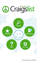
Springboard from CraigsList
The landing page for this app displays a fun 60's styled menu complete with peace sign, smiley faces, and big bold polka dots (aesthetic and minimalist design). It is perfectly apparent which areas of the menu are clickable and what each click will discover (recognition over recall). The help area is clear and easily accessible. The only thing I don't see immediately that I am used to seeing on the website is how to set a location, but I assume that would be found under "settings."
Page Carousel from Nigella
There are so many wonderful things to say about the design of this page. The page is absolutely loaded with information without feeling cluttered (aesthetic and minimalist design). There are progress indicator dots to show the number of recipes in the section as well as how far into that number you are currently viewing (system status). The icons for "heart-healthy," "vegetarian," and "video" are easily recognizable (familiar metaphors and language), and there are multiple ways to find a recipe (user control and freedom).
Metaphor from Wine Cellar
 This visually stunning masterpiece is incredibly simplistic (aesthetic and minimalist design). You begin by adding the wine from your collection with a simple plus sign (familiar metaphors and language). Your virtual cellar is filled with buttons having the appearance of the actual bottles of wine they represent. You may then view items in your wine collection by either browsing the bottles displayed (recognition over recall) or by clicking the search button (user control and freedom). I love this display so much I think I'm going to download it today!

Springboard from CraigsList
The landing page for this app displays a fun 60's styled menu complete with peace sign, smiley faces, and big bold polka dots (aesthetic and minimalist design). It is perfectly apparent which areas of the menu are clickable and what each click will discover (recognition over recall). The help area is clear and easily accessible. The only thing I don't see immediately that I am used to seeing on the website is how to set a location, but I assume that would be found under "settings."

Page Carousel from Nigella
There are so many wonderful things to say about the design of this page. The page is absolutely loaded with information without feeling cluttered (aesthetic and minimalist design). There are progress indicator dots to show the number of recipes in the section as well as how far into that number you are currently viewing (system status). The icons for "heart-healthy," "vegetarian," and "video" are easily recognizable (familiar metaphors and language), and there are multiple ways to find a recipe (user control and freedom).
Metaphor from Wine Cellar

Monday, March 11, 2013
Similar but Different
As you may have read, I am currently working on designing an app to be used for scoring games of cards/dice/dominoes. In an attempt to publish the best product possible, I found it valuable to look at some similar apps this week.
The first app I downloaded was simply called "Spades" by fishdog.net. I was hoping to see their scoreboard to get a preview of one interpretation of such. Unfortunately, they kept their score listed with each player, so there was no overall scoreboard. They also did not work their app as a partner game, but each player scored individually. As if that wasn't enough, the app did not have the functionality to bid "nil." If you bid zero and make it, it does you absolutely no good. All-in-all, I did not gain much insight from this app. I did, however, peruse the app store some more and found several scoreboards I could use for inspiration, to include the following from "Spades Free" by Optime Software LLC (on top) and "Spades" by Cliff Maier (below). I think both are very easy on the eye, the first giving more information about the current hand, and the second giving more history with regards to bids and tricks for each specific hand. It looks much more like the way I have traditionally kept score.


I continued my search and found a mobile scoreboard for games, "iKeepScore" by Tom Grimshaw. With a much higher star-rating than the app by fishdog.net, my expectations were also higher. Not only does this app have its own scoring system, which can be modified for 2-6 players, it also has a timer, a dice roller (d4, d6, d8, d10, d12, d20), and a coin flip. As you can see in the screenshot below, it even has a star system to show who is in 1st place, etc. While I like the idea of this app, it does not have all the functionality I want in mine. I want mine to be math-proof (if using this system for spades, one would have to translate the number of tricks, bags, etc. into points each round).

I believe these apps are a good starting point for building the visual component of my own. Some questions I will need to consider as I progress:
- Will I make this a single-directional app, or will the user have the option to turn the phone any direction?
- How much history is necessary to show?
- Will there be functionality to keep old scores? Post to Facebook?
Heuristic Evaluation - Part 2
Many thanks to Avery of Avery's Tech Outlook for conducting heuristic evaluations with me this week! For a sneak peek at the prototype of his app, visit his post from week six. Overall, the app was very well designed. The "cover flow" style of pictures was consistent with the type of viewing experience one might expect. The events calendar provided a great visual representation of upcoming events. Avery showed a great understanding of "aesthetic and minimalist design," keeping only a few items per page. The following are my recommendations for improvement:
Consistency and Standards
Severity rating: 2
The "Back" and "Home" navigation buttons are inconsistent throughout the prototype, some pages only having one or the other. Additionally, the buttons are inconsistent with platform conventions. Both buttons are pointing in the direction of a "Next" button. I would recommend a horizontal flip of the "Back" button as well as either changing the "Home" button to look like a house. Alternatively, the "Home" button could be replaced by a menu icon. This should decrease loading time as it pops up a small menu rather than navigating to an entire new page.
User Control and Freedom
Severity rating: 3
Currently, the events can only be viewed in calendar format. I mentioned this in previous comments to Avery, but I recommend adding a list-view to access event details as well. This would allow a user who forgot the date of an event to look it up by name rather than searching through multiple calendar dates.
Severity rating: 2
There is no option for the user to upload photos of their own. This may be deliberate, as that functionality requires a lot more effort to code, so I see this as optional, and may be something better spared from the minimum viable product (MVP) and reserved for a future release.
Aesthetic and Minimalist Design
Severity rating: 1
There are a few recommendations falling into this category, and they may be due, in-part, to creating the prototype with Balsamiq:
Finally, here is the full video of our review session. Best of luck to Avery! I think you have a great foundation for a very usable app!
Consistency and Standards
Severity rating: 2
The "Back" and "Home" navigation buttons are inconsistent throughout the prototype, some pages only having one or the other. Additionally, the buttons are inconsistent with platform conventions. Both buttons are pointing in the direction of a "Next" button. I would recommend a horizontal flip of the "Back" button as well as either changing the "Home" button to look like a house. Alternatively, the "Home" button could be replaced by a menu icon. This should decrease loading time as it pops up a small menu rather than navigating to an entire new page.
User Control and Freedom
Severity rating: 3
Currently, the events can only be viewed in calendar format. I mentioned this in previous comments to Avery, but I recommend adding a list-view to access event details as well. This would allow a user who forgot the date of an event to look it up by name rather than searching through multiple calendar dates.
Severity rating: 2
There is no option for the user to upload photos of their own. This may be deliberate, as that functionality requires a lot more effort to code, so I see this as optional, and may be something better spared from the minimum viable product (MVP) and reserved for a future release.
Aesthetic and Minimalist Design
Severity rating: 1
There are a few recommendations falling into this category, and they may be due, in-part, to creating the prototype with Balsamiq:
- Placing items in black boxes on white backgrounds ends up creating a high-contrast page, which is hard on the eyes. I recommend making a seamless black background then highlighting buttons as-needed.
- The spacing between names on the instructor landing page is uneven.
- The instructor name on the individual bio page currently shows twice, once in the title and once in the bio details next to the photo. The name does not need duplicated. I suggest getting rid of the name in the title.
- I also suggest more "whitespace" around the details on the individual instructor page. This can be accomplished by moving the photo up, centering the three lines of detail vertically on the photo, then leaving some room before the paragraph about the instructor.
Finally, here is the full video of our review session. Best of luck to Avery! I think you have a great foundation for a very usable app!
How To Get Hired as an iOS Developer
As we quickly approach that time of year when students look more heavily towards internships and seek to start their careers, I decided to do a little research. The idea was sparked by an article by Mugunth Kumar in which he discouraged companies from hiring an iOS developer based upon their portfolio. Kumar had a solid reason, in that looking at a portfolio tells you nothing about the behind-the-scenes capabilities of a developer when it comes to producing actual code. However, his alternative suggestion to companies of viewing open source contribution received a lot of flack from his readers as well. So how does a developer prepare to get a job?
Zoom In
Pick one area of development that interests you, and learn everything you can about that one area and how it integrates into the larger functionality of an application. Employers look for someone that knows their trade inside and out, so cater to that search by becoming an expert in...databases. Or security. Or game development (this is a beast of an entirely different color). This could even be a specific market, such as finance or productivity. Whatever subject you choose, get intimate with the specifics.
Zoom Out
Once you have picked an area, put yourself out there to be found. Get LinkedIn, Plaxo, Twitter, Facebook, Ecademy, etc. accounts, and build your profile. But do more than just build your profile. Like good code, your profile should be maintained. Information should be kept relevant and up-to-date. Another fantastic way to demo your expertise is to create a technical blog. Regular updates will show your potential employers your ability to stick with a project while also showing off your passion and knowledge.
Publish
Ryan of Rooster Soft Studios suggests "...the best thing to show is at least one published and non-trivial app." Not only should you be able to show a completed project, it is absolutely pertinent you know your code. You should not be so reliant upon open source that you do not understand why your code does what it does. If you can, however, contribute to open source, as suggested by Kumar, this further demonstrates your in-depth knowledge.
Network
While an app written by a single developer is a good start, it is also a good idea to show collaborative work. There are two areas in which collaboration can be shown:
Unzip
When in doubt, show some skin. Works every time! ;)
I hope this helps you plan a path to employment! And to learn more about Scott Gruby's recommendations to employers for selecting a developer, visit this post.
Publish
Ryan of Rooster Soft Studios suggests "...the best thing to show is at least one published and non-trivial app." Not only should you be able to show a completed project, it is absolutely pertinent you know your code. You should not be so reliant upon open source that you do not understand why your code does what it does. If you can, however, contribute to open source, as suggested by Kumar, this further demonstrates your in-depth knowledge.
Network
While an app written by a single developer is a good start, it is also a good idea to show collaborative work. There are two areas in which collaboration can be shown:
- Other Developers: In working on a large project, you often have to work with other developers. This is a special way to demo that area of expertise you have been preparing.
- Graphic Designers: When you demo that app you have been working on so diligently, keep in-mind "You can never make a second first impression." You have made your code streamlined and commented, why would you not want graphics that look just as amazing!?
Unzip
When in doubt, show some skin. Works every time! ;)
I hope this helps you plan a path to employment! And to learn more about Scott Gruby's recommendations to employers for selecting a developer, visit this post.
Wednesday, March 6, 2013
Mockups on Balsamiq
This week I turned my paper prototypes into a digital prototype using the toolkit provided by the ingenious folks at Balsamiq. Although there were a few processes I did not grasp intuitively, the learning curve was quite shallow, and I recommend it if you have a similar project.
I made the following changes in the transition from paper to digital:
Also, for the sake of brevity, I only added edit pages for the player entitled "John," though the other pages would work the same way. Additionally, the "Next Round" button on my "Score" page links to my "Winner" page, which in turn links back to the landing page. I built the prototype in this way, although the real "Winner" page will only display if the game has reached a final score.
And here is the prototype for you to peruse. Feel free to leave comments!!
I made the following changes in the transition from paper to digital:
- I removed the option to select which game is going to be played. For now, my MVP will only consist of scoring for a game of spades.
- Rather than calling individuals "player 1," I initialized each player with a name already entered in the buttons. This should minimize confusion as to which player number is associated with which partner.
- I added an "exit" button in the top right corner, allowing the user to quit the game in-progress and return to the main menu for a new game.
Also, for the sake of brevity, I only added edit pages for the player entitled "John," though the other pages would work the same way. Additionally, the "Next Round" button on my "Score" page links to my "Winner" page, which in turn links back to the landing page. I built the prototype in this way, although the real "Winner" page will only display if the game has reached a final score.
And here is the prototype for you to peruse. Feel free to leave comments!!
Subscribe to:
Posts (Atom)