After a fantastic semester of playing with Stencyl, gaming.js, and Unity, I have finally put together a basic pinball game. It isn't perfect...the game never actually ends, and the physics have some more tweaking, but...it plays. There have been a lot of changes since the last prototype. In addition to basic bumpers, I have added triangle bumpers, a plunger simulator, drop targets, and lanes for the ball. Also, the game now keeps score, and it counts down your remaining balls. I have learned so much this semester, but as you can see, I have only touched on the basics of writing this game. The world of battles and levels and wormholes I envisioned isn't quite here, but now that I have the foundation, I can continue building upon this fantasy world of which I dream.
In the following video, I discuss my vision and strategy as I build the game, and there is a brief clip at the end of the game in action:
If you would like to try the game for yourself, please feel free to play it online.
I hope you enjoy, and Happy Holidays!!
Sunday, December 15, 2013
Thursday, December 12, 2013
Pinball Masters, Prototype #4
I have finally gotten my flippers working in Unity! It took a while, and after trying "Lerp"ing and "Slerp"ing (and maybe even a little twerking!?), I found a YouTube video from PushyPixels that simply utilized "rotateAround". Since I am working in JavaScript, variable declaration was done a little differently, but nothing too difficult to figure out. The next issue I had was that they were using the mouse as a controller, and I wanted to use "D" for the left flipper and "K" for the right flipper, so I gave the object tags, and paired them with the GetKeyUp and GetKeyDown events. Finally, I stopped watching at the point in the video where they were still struggling with trying to get the left flipper to move correctly. I simply utilized their script, changing the positive/negative values on "maxAngle" throughout the code for the left flipper, and it worked swimmingly.
So here it is, prototype number four!
And if you would like to check out the video by PushyPixels, you can find it here.
Sunday, November 17, 2013
Pinball Battle: The Multiplayer Version of Pinball Masters
If you're already excited about Pinball Masters, wait until you hear about the multiplayer version! Imagine sitting down across from your best friend at a long, flat pinball table. Each of you have your own set of flippers, but you share a ball as you try to force the opponent into three ball losses. You have targets you can hit on your own side to earn points, which will allow you to buy equipment, such as temporary stoppers to prevent the ball from exiting your side, and one-way doors, which will reflect the ball back onto the opponent's side of the table, while allowing it through when you send it across to the other side. Once your opponent has lost three balls down their side of the table, you clench your victory!
Tuesday, November 12, 2013
Switching to Unity
Greetings! This week I have begun making the switch to using Unity3D as the development tool for my pinball game. It has a lot of incredible functionality, which means there is a lot to learn! So far, I have the main game components added to the screen, but no flipper motion yet. Here's a quick clip of the game:
Monday, November 4, 2013
"Just One Minute": A Pinball Masters Gameplay Excerpt
The player pulls back the plunger, exhales, and launches the ball onto the table. The ball speeds through the launch ramp and into the gameplay area. The player can hear the ball as it ricochets back and forth between the bumpers, causing lights to flash and points to build. Watching intently as the ball makes its way down the table, the player tries to anticipate its arrival. Noting the ball traveling directly down the center, the player attempts to gently tilt the table. Unfortunately, the ball still escapes down the drain, but is saved and automatically relaunched. This time, the player manages to activate the flipper in time to send the ball back onto the field. As the player continues to bounce the ball around the table, a series of flags are triggered, and the player is given his first mission. A friendly assistant offers to grant shielding if the player shoots the ball up the left ramp in the next 30 seconds. A skill shot launches the ball up the ramp just in time to earn a basic shield in his inventory. The player decides not to use the shield at the moment, but to wait until he has to fight the next enemy. Hopefully he can also earn some healing and weaponry by completing other missions before he has to battle THE PINBALL MASTER!
Wednesday, October 30, 2013
Pinball Prototype v1.1
The next set of steps in building the game took quite a bit more study, but I have finally added some physics components, and the ball bounces around the screen and off the bumpers and flippers. I've added a splash of color as well as a scoreboard with instructions. I do recognize there is a LOT of work to be done to make this game what I want it to be, and I'm rather excited about the upcoming modifications. In the meantime, please feel free to check out my game and let me know what you think!
 |
| Pinball Prototype Screenshot |
Monday, October 14, 2013
Pinball Prototype, v1.0
This week I built my first prototype for the pinball game. I am just getting started, so it is very basic, but I have a few elements put on-screen, and the flippers are moving correctly. Next week, I hope to get the ball moving through the screen and add some boundaries and collisions, which will compose the essential frame of the game.
If you would like to see the flippers in-action, here is the link for the current version, best viewed using Google Chrome (D and K operate flippers).
And to watch a quick preview, check out my YouTube video:
If you would like to see the flippers in-action, here is the link for the current version, best viewed using Google Chrome (D and K operate flippers).
And to watch a quick preview, check out my YouTube video:
Sunday, October 13, 2013
Updated Pinball Focus
Pinball Masters is a classic pinball game, updated with features appealing to the modern gamer. The player can earn skill masteries, add items to their inventory, progress between "levels" (tables), and fight bosses/masters. These fights will be carried out by hitting the boss with the pinball, thus deleting their health points. The bosses also have weapons to shoot at the ball, thus deleting the player's health points. Various items acquired throughout the pinball journey may provide shielding for the player or increase the hit points against the boss. Wormholes allow players to jump back and forth between tables already visited, while soundtrack and sound effects fit the theme of each table. Multiballs and extra shots can also be earned, along with temporary stoppers to prevent the ball from exiting gameplay. As in standard pinball, the player will start with three balls, and while temporary losses may be overcome, the player will ultimately try to progress to defeating the final boss and become a Pinball Master before the ball count decreases to zero.
Tuesday, October 8, 2013
Pinball Focus
Pinball Masters is a classic pinball game, updated with features appealing to the modern gamer. The player can earn skill masteries, add items to their inventory, progress between "levels" (tables), and fight bosses/masters. Wormholes will allow players to jump back and forth between tables already visited, while soundtrack and sound effects will fit the theme of each table. Multiballs and extra shots can be earned, as well as temporary stoppers to prevent the ball from exiting gameplay. As in standard pinball, a player will start with three balls, and while temporary losses may be overcome, the player will ultimately try to progress to defeating the final master before the ball count decreases to zero.
Tuesday, September 17, 2013
Game Brainstorming: Trading Card Game
I suppose it is time for me to come out of the closet, and I might as well make my confessions on my blog. It is time for me to admit publicly that I have started playing Magic the Gathering. I always envisioned this type of game as too "geeky" for me, but in all honesty, I kind of enjoy it! But, the game tends to be dominated by men. And with good reason. The game has very masculine game play. It is all about killing your enemy as quickly as you can.
I think it would be enjoyable to build an online game with trading card mechanics that would appeal to the gals. It would be a sort of...parody game, where the goal is to make your opponent lose their "cool points" rather than "life points." Some of the traits that could be included might be "bitchiness" and "fierceness," while game mechanics such as "battalion" (where you get extra abilities for attacking with multiple creatures) could be replaced with "entourage." Well, it might not be the best idea around, but it could be fun. Besides, doesn't this image look like a PMS-storm!?
 |
| Magic the Gathering: Boros Reckoner |
 |
| Magic the Gathering: Blustersquall |
Game Brainstorming: Pinball
I have always loved playing pinball. I remember when Star Wars, Episode One came out, there was a pinball machine at our theater that had a holographic image in the back of the machine that was interactive based upon ball movement, and would show cut scenes.
I also remember as a child playing Pinball Quest on the NES. For me, the thing that made this game memorable was that it had different levels, and play progressed. It was more and more difficult to pass through each level.
If I were to design my ultimate pinball game, it would definitely have different levels. As you accumulate points, you could purchase or earn upgrades, such as bumpers that prevent your ball from leaving the table. There would be challenges, such as barricades you have to destroy by bumping into them over and over, enemy objects that shoot at your flippers and ball, vortexes that suck your ball in, bosses you have to destroy, dead ends, and wormholes that jump you from level to level. Eek this sounds like such a fun game to me!
I also would like to eventually turn it into a multiplayer game, where each player sits at their own computer, and the table is designed with two ends, kind of like an air hockey table. The physics could get...interesting, but the players could hit targets that destroy their opponent's flippers, and other targets that boost their own flipper defense. What do you think? Would you like to play a round or two of battle pinball against your gamer buddies?
Monday, September 16, 2013
Game Brainstorming: Adventure Game
When I was first introduced to "video games," I started by playing this fantastic little game called "Apple Adventure." It was a text-based adventure game, where the user interacted with the computer by typing commands, and the computer would then narrate the story as the user explored the world around.
 |
| Apple Adventure |
Later, I got into several other adventure games, such as the "Escape the Room" games, as well as "Myst." One of my most recent favorites was "Tiny Bang Story" by Colibri Games. I love the way it combines world exploration with object hunting and puzzle solving.
 |
| Tiny Bang Story |
In drawing upon some of these as inspiration, last year I came up with the idea to have a word-based adventure game similar to "Apple Adventure," but utilize voice recognition instead of typing. This would allow the user to "play" such a game while driving. Imagine how much fun road trips could be!
 |
| Oculus Rift |
More recently, though, with the invention of the Oculus Rift, I think this could be taken to a much higher level of gameplay. The story could begin similarly, with nothing showing on the screen, the story narrated to you as you interact verbally with the technology, giving commands to "explore" the area until you are able to light the scene. Once the visual dynamic kicks in, the game takes off! Exploration because multi-sensory. You can now walk around and find things to use along your journey. When combined with a gameplay glove (do these exist yet?), there could be things like a combination lock that you actually twist and turn to open, weapons you have to find to fight potential enemies, maybe directions to create some witches' brew...the ideas keep coming. What do you think, does an interactive adventure game hold any intrigue for you?
Monday, April 22, 2013
Comic Book, Pt. 1
As a personal side project this semester, I will also be developing my own app with the intent of distributing a comic book. It will be an iOS native app. Without getting too much into the nitty gritty of the book, I have put together two simple prototypes to consider as interface alternatives. The comic book will initially only include one "book" (episode/chapter...still working on terminology), so further versions will need to include capability for multiple book navigation. The MVP, however, will start with a splash screen, enter right into the first page of the book, and have a way to move from scene to scene. The main differences between the two prototypes, however, is in the main navigation. If a user decides to exit the page view, they will be presented a way in which they may skip to alternate pages. These differences will be outlined in greater detail below.

The first version begins with a splash screen to be viewed during loading. I am still debating whether or not to include a progress indicator for this activity. Because the app is loading photos, the build could take a while, and the user should be notified the app is still functioning. On the other hand, I do not want the progress bar to take away from the comic book feel of the app. There are several progress indicators with a tech-y feel that might transition nicely, so...that decision will remain pending.

Once the program has loaded, the user will be directly presented the first page of the book. "Page turn" indicators in the bottom corners will indicate tap areas to navigate forward and backward through the book. There will also be a "home" button in the top, which will allow the user to access the main navigation mentioned earlier.

The main navigation will be presented in a grid view, just like a standard photo album. This will allow the user to skip forward or backward to view a different part of the book. Once clicked, the user will be taken back into page view as seen above.
The second version also starts with a standard splash screen while the program loads. That is then followed by a similar page view, but the "page turn" indicators have been left out in favor of a swipe navigation between pages, with a page turn animation instead. Also, the "home" button has been switched to a "close" button in the top right corner. Finally, the main navigation is presented in a carousel format.


These two paper prototypes will be used this week for testing as follows:
Goals
-Are "page turn" indicators necessary?
-Is a progress indicator necessary?
-Which navigation style is preferred?
Participants
I intend to obtain feedback from 25+ potential users. I will begin by testing the others on the comic book committee (3 individuals) as well several of my easily contacted friends (8 individuals). I will augment those numbers with other individuals from my classes and environment as well. I intend to have all data obtained by Wednesday.
Method/Tasks
I will first give the test subject a short introduction to the process the test, then flip a coin to determine which version will be presented first. I will then present the first splash screen to the individual and start a timer. I anticipate the user will tap the splash screen once. After that, I will stop the timer upon their next action, as this action will most likely be out of frustration rather than expectation. I will simultaneously present them with the next page, which is the first screen of the book. I anticipate those with the "page turn" indicators presented first will immediately try to use those, but when presented with the other interface will have a little more difficulty transitioning to swipe movements. I will have two or three additional "book pages" prepared for the user to navigate through, and will run through the experiment until the user decides to quit.
Upon completion, I will ask the user the following three questions:
-Which style of navigation did you prefer (carousel/grid)?
-Which method of turning pages did you prefer (swipe/tap)?
-Did the "page turn" indicators augment your user experience?
Measures
The timing of the initial sequence will later be compared to actual load times to determine whether or not a progress indicator is necessary. The user comments will also be taken into consideration and tested at a 90% confidence interval. I also will need to put both prototypes on the same color of paper so that does not influence their decision.
Stay tuned to find out what comes of the experimentation!
Sunday, April 21, 2013
Implementation, Pt. 2
After an in-depth discussion with our instructor, we boiled our project down to the absolute essentials we need to include in our MVP, and we decided the best route to go for now is to simply build an app where users can read jokes. We will postpone implementing any user submissions, marking favorites, etc. for future versions. As such, we also decided to develop two versions of our interface. Our first version opens each new joke into a separate screen. Here are pictures of the landing page as well as the first joke opened.
For our second version, we decided to test a collapsible list (that's the term used by jQuery Mobile, while 4ourth Mobile uses the term "windowshade"). Here is a screenshot demonstrating two jokes open simultaneously.
User testing will begin shortly on these two different versions, followed by more detailed CSS designing to implement different visual elements.
 |
| Version 1, Home Screen |
 |
| Version 1, Joke 1 |
 |
| Version 2 |
Show Me More
In a return glimpse at possible designs this week, we take a look at ways of displaying more information to the user, as outlined by 4ourth Mobile Design in the chapter "Revealing More Information". The common theme behind this section is revealing additional information on the same screen where the user is already working rather than taking the user to a new screen. This can be done in several ways. The first is a simple pop-up. Apple uses this design a lot to confirm actions before proceeding. Here, the app Bump uses a pop-up menu, which populates the screen from the bottom:
Another popular method is to employ a windowshade concept where information spreads, revealing information in a way that it seems as though the window shades have been drawn, granting access to information previously hidden behind them. Here are two examples of the pattern from the iPhone's Weather app as well as their home screen menu:
Unfortunately, as you can see, sometimes the revealing of information distorts an otherwise adorable photo. Maybe it would be better to employ this as a pop-up, thus covering a portion of a photo rather than slicing it into pieces. What do you think?
 |
| Bump |
 |
| Weather |
 |
| Home Screen |
Wednesday, April 10, 2013
Implementation, Pt. 1
After Martin and I got together and reviewed our four prototypes, I sat down and started building the project. This week I was able to put together the main navigation. Although we decided we would prefer to have filmstrip navigation, I have not yet been able to figure out how to implement that, so I went with a menu bar across the top. We are using jQuery Mobile to put the project together, which utilizes basic HTML/CSS to build a web app. For anyone interested in seeing the preliminary implementation, it is currently being hosted here. Stay tuned for more information as the project progresses!
So Many Choices
Before Martin and I began any project implementation, we decided to bring together several prototypes to ensure we had the design we wanted. He already had one prototype, so he submitted a second, and I also submitted two prototypes.
The first I designed utilizes menu navigation, with the drop-down menu in the upper right-hand corner of the screen. The "Read" page also requires several steps with the user navigating from the broad category to a more narrow category. Here are some photos of this prototype:


The first I designed utilizes menu navigation, with the drop-down menu in the upper right-hand corner of the screen. The "Read" page also requires several steps with the user navigating from the broad category to a more narrow category. Here are some photos of this prototype:


The other prototype I submitted used filmstrip navigation. I also recommended just letting the user browse all categories. I think this design looks incredibly sleek:

Ultimately, Martin and I agreed on filmstrip navigation. He also suggested we add icons at the top of the "Read" page to act as category filters, and those same icons can be used to add the category when submitting a joke. The idea sounded fantastic to me!
As we progress and further consider implementation, we need to solicit some user feedback. We will offer the user a preview of the joke on the main "Read" page. When they click on the joke, we need to decide whether the list will expand to allow the joke to fill out the screen or if we will instead choose to load a new screen displaying just the single joke. This is probably something that would be better tested directly on the mobile device so the user can see just how cluttered the screen becomes when adding the joke in the middle of the list. Ultimately, that means writing the code for two different navigation styles, but I think that is within the scope of my capabilities. If you would like to be one of our guinea pigs, please leave a comment, and I will get in touch!
I've Got the Power!
 |
| Ringer Off |
 |
| Ringer On |
 |
| Confirm Purchase |
 |
| Confirm Delete |
Ultimately, providing and requesting confirmation or feedback leaves the control, the power in the user's hands.
Tuesday, March 26, 2013
Testing, Testing, 1-2-3
Alas, there comes a time in the lifecycle of all software, when the project must be tested. Keeping the test in mind while building a project can help a programmer ward off potential pitfalls throughout the process, so it is important to begin thinking about testing early, even during the design process.
Since Martin and I have decided to build a web app, we will have the option to utilize two types of testing. The first method will involve inviting friends to test the app on our own individual devices (that is, Martin's phone and my phone). This will act as a pilot study, pointing out any major flaws in usability.
Once we have finished the pilot study, we will progress to larger-scale testing. This will be done by soliciting feedback on a shared version of our app that can be run on a mobile emulator.
We will look at the following things when we conduct testing:
-Does the app fail?
-How long does the average user spend in the app?
-In which areas of the app does the user spend the most time?
In addition to the above objective questions, which will be measured behind-the-scenes, we will solicit the following subjective material, to be rated on a scale to be defined for the user:
-How difficult was the app to learn?
-How much would you pay for this app?
and open-ended questions:
-What additional functionality would you like to see added to this app?
-Did anything bother you about this app?
The questions asked of the testers will be submitted anonymously through SurveyMonkey. Those are my suggestions, and now I turn it over to Martin for further comment...
I See a Pattern - Part 2
This week, I will be sharing with you some more examples of patterns related to the way in which information can be displayed on a mobile app. These patterns fall under categories laid out by the 4ourth mobile patterns wiki.
Thumbnail List
One of the most instantly recognizable ways to display information is in a thumbnail list. This is often used with media or news items, where an image is displayed next to a caption describing the article or video that can be reached by clicking on each item. Here are two examples, one from the iTunes app and the other from the older YouTube app.
Grid
4ourth describes this pattern as "a set of tiles." Usually when we see this pattern, we see bordered squares, as in the example on the left from the iPhone's Photos app. However, Doodle Devil makes clever use of this pattern, arranging borderless, clickable icons into a grid:
Thumbnail List
One of the most instantly recognizable ways to display information is in a thumbnail list. This is often used with media or news items, where an image is displayed next to a caption describing the article or video that can be reached by clicking on each item. Here are two examples, one from the iTunes app and the other from the older YouTube app.
 |
| iTunes |
 |
| YouTube |
Grid
4ourth describes this pattern as "a set of tiles." Usually when we see this pattern, we see bordered squares, as in the example on the left from the iPhone's Photos app. However, Doodle Devil makes clever use of this pattern, arranging borderless, clickable icons into a grid:
 |
| Photos |
 |
| Doodle Devil |
Tuesday, March 19, 2013
Implementation Strategy
Since Martin and I have teamed up, I now have to keep in mind there are two of us working on the same app. Therefore, in my implementation strategy, I want to ensure I build foundational material first, allowing Martin to test. We are going to meet up this coming Saturday to discuss our plan a little more in-depth, but for now, this is my tentative idea of how the rest of the semester will progress:
During Spring Break, I will personally be working through some of the optional assignments I have not completed in this class, as well as working my way through the iOS programming class offered free through Stanford on iTunes.
The first week of April will be focused on building the basic navigational structure, which will allow the user to move from screen to screen through the app. This will lay a foreground and allow Martin to design any background images to fit around the data.
During week 2, I will work on telling the app how to populate the "Read" screen. This will utilize persistent data...which means I'll have to learn about how to utilize that capability.
The following week, I will add functionality for the "Create" screen. This is how we will be able to grow our data - through user submissions.
The final piece of the puzzle will be the "Save" or "Favorites" capabilities. This will build upon both the "Read" and "Create" functionalities, so it is pertinent to have them completed first.
And this brings us to May, which means final testing and publishing. We will also use this time to beef up our joke database so users have something to start with immediately upon using the app.
The MVP for this will be incredibly basic, but possible future enhancement ideas include log-in and sharing capabilities, adjustable settings, as well as a rating system.
Monday, March 18, 2013
I See a Pattern
For anyone beginning to work on the design portion of their app, there is a fantastic site for mobile patterns at 4ourth mobile patterns wiki. In looking through the composition section of the site, there are a few areas where there are no examples. This week's post fills in a few of those gaps. (Note: All screenshots taken on iPhone).
Scroll

The first category listed for design consideration is the way in which an application scrolls through items or screens. This picture from my "Contacts" menu shows how they allow you to jump through the scrollbar by clicking on a letter of the alphabet.

This screenshot shows an indicator bar at the bottom, letting me know how far I have scrolled through my photos.

And this one shows the "filmstrip" method of scrolling, which is my favorite. The indicator bar is a series of dots at the bottom. I enjoy this method because it provides information while being very nonintrusive.
Advertising

I also feel it extremely important to address advertisements. Some developers will insert ads into the app as a "gate" of sorts, through which you must pass in order to get to where you are going, in much the same way as commercials appear on TV. You have to sit through them in order to watch the next portion of the show. Here is one such ad from Mr. Giggle.

For those that need ad support in order to fund their app, there are much better ways to integrate ads into the software. In this example, the company mobileDELUXE has place a clickable "thank you" at the bottom of the screen, which takes you to their company website.
An even better example of seamless integration is this screenshot from SoundHound. After identifying the song you are listening to, it offers the opportunity to purchase that song on iTunes.
Overall, a better choice for any app is one that is smooth and seamless. Intrusive ads can prevent a user from enjoying an app and sometimes will even cause a user to cease and search out a different app, even for a price.
Scroll

The first category listed for design consideration is the way in which an application scrolls through items or screens. This picture from my "Contacts" menu shows how they allow you to jump through the scrollbar by clicking on a letter of the alphabet.

This screenshot shows an indicator bar at the bottom, letting me know how far I have scrolled through my photos.

And this one shows the "filmstrip" method of scrolling, which is my favorite. The indicator bar is a series of dots at the bottom. I enjoy this method because it provides information while being very nonintrusive.
Advertising

I also feel it extremely important to address advertisements. Some developers will insert ads into the app as a "gate" of sorts, through which you must pass in order to get to where you are going, in much the same way as commercials appear on TV. You have to sit through them in order to watch the next portion of the show. Here is one such ad from Mr. Giggle.

For those that need ad support in order to fund their app, there are much better ways to integrate ads into the software. In this example, the company mobileDELUXE has place a clickable "thank you" at the bottom of the screen, which takes you to their company website.

An even better example of seamless integration is this screenshot from SoundHound. After identifying the song you are listening to, it offers the opportunity to purchase that song on iTunes.
Overall, a better choice for any app is one that is smooth and seamless. Intrusive ads can prevent a user from enjoying an app and sometimes will even cause a user to cease and search out a different app, even for a price.
Sunday, March 17, 2013
Heuristic Evaluation - Part 3
This week, I will be giving some feedback to Martin Watts on his prototype for a joke application. If you are interested, you can view his prototype on his blog. Martin and I will be working together throughout the rest of the semester as a programmer/designer pair to develop an app. Without further adieu...
Consistency and Standards
Severity Rating: 2
The biggest issue I noticed with the "Joke Around" app was the idea of "saved" jokes. Here, the word "save" seems a little out of context. Instead of using "Save," I would use "Add to Favorites" and change the "Saved" tab to "Favorites."
Aesthetic and Minimalist Design
Severity Rating: 1
The "Read" page has a lot more information on it than I think will fit onto the screen of a mobile device. Once you begin designing, I'm sure this will work itself out.
Error Prevention
Severity Rating: 2
When entering a new joke, I would recommend a "preview" before it saves it to the system.
Also, specifically for Martin: it has been a while since I have used android, and since you were designing with that in-mind, I am not sure about the design. Specifically, I am talking about the navigation. To me, it looks more web than mobile. On the iOS, a lot of interaction is done with icons. For example, instead of a button that says "Add to Favorites," there would be a heart, and when you click the heart, this performs the action of adding to "Favorites" and is indicated by filling in the heart. Additionally, tabs and a nav bar at the top are uncommon on iOS. Often times, the main navigation is found in a list under the menu icon in the top right corner. And the categories are usually accessed in another manner, similar to the expandable menus you have on your current "Saved" page. When we meet later this week, let's sit down and look really in-depth at the navigation.
And finally, here is a video of me walking through the prototype:
Tuesday, March 12, 2013
Sleek, Sexy Navigation
In thinking about the interface of a mobile application, it is crucial to keep in-mind the ten heuristic categories as introduced by Scott Klemmer. I found several navigation designs by Theresa Neil that embody the heuristics and look absolutely stunning.

Springboard from CraigsList
The landing page for this app displays a fun 60's styled menu complete with peace sign, smiley faces, and big bold polka dots (aesthetic and minimalist design). It is perfectly apparent which areas of the menu are clickable and what each click will discover (recognition over recall). The help area is clear and easily accessible. The only thing I don't see immediately that I am used to seeing on the website is how to set a location, but I assume that would be found under "settings."
Page Carousel from Nigella
There are so many wonderful things to say about the design of this page. The page is absolutely loaded with information without feeling cluttered (aesthetic and minimalist design). There are progress indicator dots to show the number of recipes in the section as well as how far into that number you are currently viewing (system status). The icons for "heart-healthy," "vegetarian," and "video" are easily recognizable (familiar metaphors and language), and there are multiple ways to find a recipe (user control and freedom).
Metaphor from Wine Cellar
 This visually stunning masterpiece is incredibly simplistic (aesthetic and minimalist design). You begin by adding the wine from your collection with a simple plus sign (familiar metaphors and language). Your virtual cellar is filled with buttons having the appearance of the actual bottles of wine they represent. You may then view items in your wine collection by either browsing the bottles displayed (recognition over recall) or by clicking the search button (user control and freedom). I love this display so much I think I'm going to download it today!

Springboard from CraigsList
The landing page for this app displays a fun 60's styled menu complete with peace sign, smiley faces, and big bold polka dots (aesthetic and minimalist design). It is perfectly apparent which areas of the menu are clickable and what each click will discover (recognition over recall). The help area is clear and easily accessible. The only thing I don't see immediately that I am used to seeing on the website is how to set a location, but I assume that would be found under "settings."

Page Carousel from Nigella
There are so many wonderful things to say about the design of this page. The page is absolutely loaded with information without feeling cluttered (aesthetic and minimalist design). There are progress indicator dots to show the number of recipes in the section as well as how far into that number you are currently viewing (system status). The icons for "heart-healthy," "vegetarian," and "video" are easily recognizable (familiar metaphors and language), and there are multiple ways to find a recipe (user control and freedom).
Metaphor from Wine Cellar

Monday, March 11, 2013
Similar but Different
As you may have read, I am currently working on designing an app to be used for scoring games of cards/dice/dominoes. In an attempt to publish the best product possible, I found it valuable to look at some similar apps this week.
The first app I downloaded was simply called "Spades" by fishdog.net. I was hoping to see their scoreboard to get a preview of one interpretation of such. Unfortunately, they kept their score listed with each player, so there was no overall scoreboard. They also did not work their app as a partner game, but each player scored individually. As if that wasn't enough, the app did not have the functionality to bid "nil." If you bid zero and make it, it does you absolutely no good. All-in-all, I did not gain much insight from this app. I did, however, peruse the app store some more and found several scoreboards I could use for inspiration, to include the following from "Spades Free" by Optime Software LLC (on top) and "Spades" by Cliff Maier (below). I think both are very easy on the eye, the first giving more information about the current hand, and the second giving more history with regards to bids and tricks for each specific hand. It looks much more like the way I have traditionally kept score.


I continued my search and found a mobile scoreboard for games, "iKeepScore" by Tom Grimshaw. With a much higher star-rating than the app by fishdog.net, my expectations were also higher. Not only does this app have its own scoring system, which can be modified for 2-6 players, it also has a timer, a dice roller (d4, d6, d8, d10, d12, d20), and a coin flip. As you can see in the screenshot below, it even has a star system to show who is in 1st place, etc. While I like the idea of this app, it does not have all the functionality I want in mine. I want mine to be math-proof (if using this system for spades, one would have to translate the number of tricks, bags, etc. into points each round).

I believe these apps are a good starting point for building the visual component of my own. Some questions I will need to consider as I progress:
- Will I make this a single-directional app, or will the user have the option to turn the phone any direction?
- How much history is necessary to show?
- Will there be functionality to keep old scores? Post to Facebook?
Heuristic Evaluation - Part 2
Many thanks to Avery of Avery's Tech Outlook for conducting heuristic evaluations with me this week! For a sneak peek at the prototype of his app, visit his post from week six. Overall, the app was very well designed. The "cover flow" style of pictures was consistent with the type of viewing experience one might expect. The events calendar provided a great visual representation of upcoming events. Avery showed a great understanding of "aesthetic and minimalist design," keeping only a few items per page. The following are my recommendations for improvement:
Consistency and Standards
Severity rating: 2
The "Back" and "Home" navigation buttons are inconsistent throughout the prototype, some pages only having one or the other. Additionally, the buttons are inconsistent with platform conventions. Both buttons are pointing in the direction of a "Next" button. I would recommend a horizontal flip of the "Back" button as well as either changing the "Home" button to look like a house. Alternatively, the "Home" button could be replaced by a menu icon. This should decrease loading time as it pops up a small menu rather than navigating to an entire new page.
User Control and Freedom
Severity rating: 3
Currently, the events can only be viewed in calendar format. I mentioned this in previous comments to Avery, but I recommend adding a list-view to access event details as well. This would allow a user who forgot the date of an event to look it up by name rather than searching through multiple calendar dates.
Severity rating: 2
There is no option for the user to upload photos of their own. This may be deliberate, as that functionality requires a lot more effort to code, so I see this as optional, and may be something better spared from the minimum viable product (MVP) and reserved for a future release.
Aesthetic and Minimalist Design
Severity rating: 1
There are a few recommendations falling into this category, and they may be due, in-part, to creating the prototype with Balsamiq:
Finally, here is the full video of our review session. Best of luck to Avery! I think you have a great foundation for a very usable app!
Consistency and Standards
Severity rating: 2
The "Back" and "Home" navigation buttons are inconsistent throughout the prototype, some pages only having one or the other. Additionally, the buttons are inconsistent with platform conventions. Both buttons are pointing in the direction of a "Next" button. I would recommend a horizontal flip of the "Back" button as well as either changing the "Home" button to look like a house. Alternatively, the "Home" button could be replaced by a menu icon. This should decrease loading time as it pops up a small menu rather than navigating to an entire new page.
User Control and Freedom
Severity rating: 3
Currently, the events can only be viewed in calendar format. I mentioned this in previous comments to Avery, but I recommend adding a list-view to access event details as well. This would allow a user who forgot the date of an event to look it up by name rather than searching through multiple calendar dates.
Severity rating: 2
There is no option for the user to upload photos of their own. This may be deliberate, as that functionality requires a lot more effort to code, so I see this as optional, and may be something better spared from the minimum viable product (MVP) and reserved for a future release.
Aesthetic and Minimalist Design
Severity rating: 1
There are a few recommendations falling into this category, and they may be due, in-part, to creating the prototype with Balsamiq:
- Placing items in black boxes on white backgrounds ends up creating a high-contrast page, which is hard on the eyes. I recommend making a seamless black background then highlighting buttons as-needed.
- The spacing between names on the instructor landing page is uneven.
- The instructor name on the individual bio page currently shows twice, once in the title and once in the bio details next to the photo. The name does not need duplicated. I suggest getting rid of the name in the title.
- I also suggest more "whitespace" around the details on the individual instructor page. This can be accomplished by moving the photo up, centering the three lines of detail vertically on the photo, then leaving some room before the paragraph about the instructor.
Finally, here is the full video of our review session. Best of luck to Avery! I think you have a great foundation for a very usable app!
How To Get Hired as an iOS Developer
As we quickly approach that time of year when students look more heavily towards internships and seek to start their careers, I decided to do a little research. The idea was sparked by an article by Mugunth Kumar in which he discouraged companies from hiring an iOS developer based upon their portfolio. Kumar had a solid reason, in that looking at a portfolio tells you nothing about the behind-the-scenes capabilities of a developer when it comes to producing actual code. However, his alternative suggestion to companies of viewing open source contribution received a lot of flack from his readers as well. So how does a developer prepare to get a job?
Zoom In
Pick one area of development that interests you, and learn everything you can about that one area and how it integrates into the larger functionality of an application. Employers look for someone that knows their trade inside and out, so cater to that search by becoming an expert in...databases. Or security. Or game development (this is a beast of an entirely different color). This could even be a specific market, such as finance or productivity. Whatever subject you choose, get intimate with the specifics.
Zoom Out
Once you have picked an area, put yourself out there to be found. Get LinkedIn, Plaxo, Twitter, Facebook, Ecademy, etc. accounts, and build your profile. But do more than just build your profile. Like good code, your profile should be maintained. Information should be kept relevant and up-to-date. Another fantastic way to demo your expertise is to create a technical blog. Regular updates will show your potential employers your ability to stick with a project while also showing off your passion and knowledge.
Publish
Ryan of Rooster Soft Studios suggests "...the best thing to show is at least one published and non-trivial app." Not only should you be able to show a completed project, it is absolutely pertinent you know your code. You should not be so reliant upon open source that you do not understand why your code does what it does. If you can, however, contribute to open source, as suggested by Kumar, this further demonstrates your in-depth knowledge.
Network
While an app written by a single developer is a good start, it is also a good idea to show collaborative work. There are two areas in which collaboration can be shown:
Unzip
When in doubt, show some skin. Works every time! ;)
I hope this helps you plan a path to employment! And to learn more about Scott Gruby's recommendations to employers for selecting a developer, visit this post.
Publish
Ryan of Rooster Soft Studios suggests "...the best thing to show is at least one published and non-trivial app." Not only should you be able to show a completed project, it is absolutely pertinent you know your code. You should not be so reliant upon open source that you do not understand why your code does what it does. If you can, however, contribute to open source, as suggested by Kumar, this further demonstrates your in-depth knowledge.
Network
While an app written by a single developer is a good start, it is also a good idea to show collaborative work. There are two areas in which collaboration can be shown:
- Other Developers: In working on a large project, you often have to work with other developers. This is a special way to demo that area of expertise you have been preparing.
- Graphic Designers: When you demo that app you have been working on so diligently, keep in-mind "You can never make a second first impression." You have made your code streamlined and commented, why would you not want graphics that look just as amazing!?
Unzip
When in doubt, show some skin. Works every time! ;)
I hope this helps you plan a path to employment! And to learn more about Scott Gruby's recommendations to employers for selecting a developer, visit this post.
Wednesday, March 6, 2013
Mockups on Balsamiq
This week I turned my paper prototypes into a digital prototype using the toolkit provided by the ingenious folks at Balsamiq. Although there were a few processes I did not grasp intuitively, the learning curve was quite shallow, and I recommend it if you have a similar project.
I made the following changes in the transition from paper to digital:
Also, for the sake of brevity, I only added edit pages for the player entitled "John," though the other pages would work the same way. Additionally, the "Next Round" button on my "Score" page links to my "Winner" page, which in turn links back to the landing page. I built the prototype in this way, although the real "Winner" page will only display if the game has reached a final score.
And here is the prototype for you to peruse. Feel free to leave comments!!
I made the following changes in the transition from paper to digital:
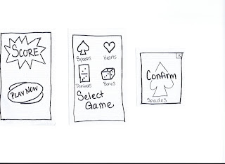
- I removed the option to select which game is going to be played. For now, my MVP will only consist of scoring for a game of spades.
- Rather than calling individuals "player 1," I initialized each player with a name already entered in the buttons. This should minimize confusion as to which player number is associated with which partner.
- I added an "exit" button in the top right corner, allowing the user to quit the game in-progress and return to the main menu for a new game.
Also, for the sake of brevity, I only added edit pages for the player entitled "John," though the other pages would work the same way. Additionally, the "Next Round" button on my "Score" page links to my "Winner" page, which in turn links back to the landing page. I built the prototype in this way, although the real "Winner" page will only display if the game has reached a final score.
And here is the prototype for you to peruse. Feel free to leave comments!!
Monday, February 25, 2013
Heuristic Evaluation
This week, I had the pleasure of meeting up with the author of Steve's Mobile Blog to exchange evaluations of each other's prototypes. According to the assignment, we were to assess the prototypes based on ten categories, as outlined by Scott Klemmer in his class on Human-Computer Interaction, which you can find here. Additionally, for each issue discovered, a severity rating was to be assigned in-accordance-with standards set forth by the Nielsen Norman Group. After sitting with Steve, I found the following potential issues with his prototype:
I think the idea of drawing the list of available locations for review from places where they have already "checked-in" severely limits the user. Supposing the user does not use the "check-in" feature available in some other apps, this would then be rendered useless for the individual. The flexibility and efficiency category is thus violated. Since the app will still function without changing this, I gave a severity rating of 1.
There were multiple screens in which there was no way to go back to a previous screen. Unfortunately, users often make mistakes. In order to allow better user control and freedom, I recommend adding functionality to return to the menu and/or previous screens. While this will not cause the app to break, it can leave a user quite frustrated at the inability to quickly access the desired functionality. Therefore, I gave this a severity rating of 4.
I encountered some confusing functionality when landing on the "location selection" page. Swiping left was supposed to give one option, while swiping right presented a different option. In order to minimize the learning curve and increase recognition over recall, I recommend changing to use a single swipe to either revel buttons with the desired options or reveal a deeper level with multiple options. Again, this would not break the app, and although it has a steeper learning curve, it is not going to prevent users from accessing all features. The severity rating for this issue is 2.
Finally, I recommend a complete revamping of the "rating" page in pursuit of an aesthetic and minimalist design. I have broken this down into several categories:
Overall, I think Steve has a great design, and I look forward to seeing the final product!
I think the idea of drawing the list of available locations for review from places where they have already "checked-in" severely limits the user. Supposing the user does not use the "check-in" feature available in some other apps, this would then be rendered useless for the individual. The flexibility and efficiency category is thus violated. Since the app will still function without changing this, I gave a severity rating of 1.
There were multiple screens in which there was no way to go back to a previous screen. Unfortunately, users often make mistakes. In order to allow better user control and freedom, I recommend adding functionality to return to the menu and/or previous screens. While this will not cause the app to break, it can leave a user quite frustrated at the inability to quickly access the desired functionality. Therefore, I gave this a severity rating of 4.
I encountered some confusing functionality when landing on the "location selection" page. Swiping left was supposed to give one option, while swiping right presented a different option. In order to minimize the learning curve and increase recognition over recall, I recommend changing to use a single swipe to either revel buttons with the desired options or reveal a deeper level with multiple options. Again, this would not break the app, and although it has a steeper learning curve, it is not going to prevent users from accessing all features. The severity rating for this issue is 2.
Finally, I recommend a complete revamping of the "rating" page in pursuit of an aesthetic and minimalist design. I have broken this down into several categories:
- The existence of both a "title" and a "comment" field seems extraneous. The goal of the app is to allow quick reviews, but having multiple editable text fields, even if they are not required fields, causes the user to think they must fill out the form completely before submission. I recommend reducing this to a single editable text field for comments.
- In order to streamline the process, I would also allow for rating in categories, such as "cleanliness," "service," etc. That would allow a single tap to imply commentary, thus reducing the amount of time spent typing in the text field.
Overall, I think Steve has a great design, and I look forward to seeing the final product!
Monday, February 18, 2013
Storyboards and Prototypes
Point of View
This week we were asked to consider applications that fit a certain point of view. In my own personal life, I am attempting to go paperless, so that was the driving force behind the apps I chose to storyboard. This fits in very well with the digital age. Whether it's saving trees, saving money, or just being in a place where you don't have paper, a mobile app can come in handy!
Storyboard
Paperless Fitness
A few years back, I was following the workouts from the CrossFit website regularly. I would log onto the website, write down the workout of the day as well as my previous stats for that workout, go to the gym, record my stats for the week, then go back to my computer to enter my new stats into my digital record. This was an incredibly inefficient, but it worked at the time. The following storyboard depicts an idea for an app that takes care of that whole process.

Paperless Scoring
When visiting my family over Christmas, we played cards or dominoes every night. I have always been the one to keep score, but this year my sister wanted to take care of that. Unfortunately, she could use a little brush-up on her basic math skills! Additionally, the notepad my parents had handy would not hold an entire game, so we had to flip the paper over mid-game, and hope the sleepy scorekeeper would record everything correctly. Here is the storyboard for an app to solve the paper and math problems.

Prototypes
I selected the scoring app for my prototypes. The first model I built was what I initially believed would be closer to what I would ultimately construct, but after designing my second model, I found some problems with the first one.
Model 1


Model 2


Finally, if you would like to see the prototypes in action, here is a video demonstration and self-critique. Until next time...
Monday, February 11, 2013
No use listening to shoutcasting if you can't hear what's going on with team Dignitas!
If that title has you utterly confused, you're not alone. Several months ago, I would have felt the same way. But relationships have a way of changing our interests, or at a minimum, our knowledge-base. Our assignment this week followed in a similar vein. Continue reading to find out what I mean...

The Mission
Observe two individuals participating in an activity. Document observed "successes, breakdowns, and latent opportunities" relating to the use or lack of mobile devices. Interview individuals and look for inspiration.
The Match
As I mentioned above, relationships can expand our horizons. For this event, I chose to observe a group of friends playing Dungeons & Dragons, something with which I have absolutely zero experience! I was "fortunate" enough to have also been observing their session the previous week, which enabled me to focus my thoughts and questioning for this event. Here are some of the observations I had, as well as the input from my participants about opportunities to turn break-downs into successes!
 |
| Nihil Dice Roller |
The Noob
1. Breakdown: too new to have his own dice
Success #1: used a virtual dice roller
Success #2: late friend arrived and brought entire bag of dice!
2. Breakdown: unfamiliar with rules/character options
Success: printed "baseball cards" for each skill
Latent opportunity: virtualize these cards
 |
| "The Noob" finally got his dice |
Mr. Tardy
3. Breakdown: didn't show up on time
Success: DM played his character for him
4. Breakdown: argumentative, disputes rules
Success: What DM says stands
The Almighty (Dungeon Master)
5. Breakdown: members didn't show up on time (yep - this one affected had multiple effects)
Success: tailored game on-the-spot to fit current characters
6. Breakdown: difficulty in keeping track of non-player characters
Latent opportunity: character portfolio
7. Breakdown: difficulty keeping track of initiative order
Success: representative tokens placed in order after initiative roll
8. Breakdown: has to re-draw map for each battle
Latent opportunity: virtual game board
9. Breakdown: monsters must be tailored for each battle, can be hard for new DM
Latent opportunity: monster generator
 |
| DM must redraw this map for every battle |
The Crowd
10. Breakdown: players got hungry!
Latent opportunity: ping the girlfriend - can she bring food? (saves delivery charge)
11. Breakdown: splitting the food bill
Latent opportunity: restaurant can charge multiple cards rather than a single one for delivery items
12. Breakdown: table does not have room for much growth
Latent opportunity: each player has virtual machine with stats, abilities, etc.
13. Breakdown: can't see teammates' stats
Latent opportunity: big scoreboard on the wall (whiteboard suffices)
14. Breakdown: week 1, there was no mat
Success: borrowed pieces from another table top game - sufficed, but ordered mat, arrived for week 2
15. Breakdown: difficulty keeping track of status
Success: borrowed runes from "Ascension" game to visualize more quickly
The Muses
This game, mentioned in item 15, has been converted into an app for the iPhone. The designers for this did a wonderful job with their layout. They essentially use thumbnails grouped into sections according to the card's type. And despite the overwhelming amount of information displayed on the screen, they have still managed to achieve the look of a board game. While there are many takeaways from this app, the main one I notice is the ability to keep information concise and organized.
Star Wars Soundtrack
Any epic adventure needs a soundtrack that is just as epic! While a D&D scoreboard may not need a fully fleshed-out feature-length soundtrack, the music and sounds included need to fit the app. They should augment the experience, not annoy the user.
I cannot imagine my childhood without Legos. The way these toys fit together with each other is just incredible, isn't it!? I think a well-designed app will be the same, in that the components will complement each other, they will build off each other.
Bullseye
An app does not need to be a "one-size fits all" product, but should be tailored for the target audience. If designing an app that times children brushing their teeth, the app should be simple enough for a child to use. This concept should encompass everything from aesthetics/color choice to functionality to word choice. Keeping the target audience as center focus will help designers hit the elusive "bullseye."
And now we have come full-circle. The quote in this blog's title is the first thing I heard when my boyfriend walked in the door tonight. It references his excitement of watching the webcast ("shoutcast") of the North American Qualifier Tournament of this game. The popularity of the game is astounding! With an average of 12-million players daily from around the world, a designer considering League of Legends has to be thinking, "What keeps them coming back?" A good app will not be a "one-hit wonder" but will welcome the user to continue the experience over and over.
And speaking of coming back, remember to stop by again next week for a closer look at native apps! In the meantime, if you would like to hear a few ways to improve the spa experience with mobile devices, I have made a short video: Mobile Devices at the Spa.
Subscribe to:
Comments (Atom)