Tuesday, September 17, 2013

Game Brainstorming: Trading Card Game

I suppose it is time for me to come out of the closet, and I might as well make my confessions on my blog. It is time for me to admit publicly that I have started playing Magic the Gathering. I always envisioned this type of game as too "geeky" for me, but in all honesty, I kind of enjoy it! But, the game tends to be dominated by men. And with good reason. The game has very masculine game play. It is all about killing your enemy as quickly as you can.

Magic the Gathering: Boros Reckoner
I think it would be enjoyable to build an online game with trading card mechanics that would appeal to the gals. It would be a sort of...parody game, where the goal is to make your opponent lose their "cool points" rather than "life points." Some of the traits that could be included might be "bitchiness" and "fierceness," while game mechanics such as "battalion" (where you get extra abilities for attacking with multiple creatures) could be replaced with "entourage." Well, it might not be the best idea around, but it could be fun. Besides, doesn't this image look like a PMS-storm!?

Magic the Gathering: Blustersquall

Game Brainstorming: Pinball

I have always loved playing pinball. I remember when Star Wars, Episode One came out, there was a pinball machine at our theater that had a holographic image in the back of the machine that was interactive based upon ball movement, and would show cut scenes.


I also remember as a child playing Pinball Quest on the NES. For me, the thing that made this game memorable was that it had different levels, and play progressed. It was more and more difficult to pass through each level.


If I were to design my ultimate pinball game, it would definitely have different levels. As you accumulate points, you could purchase or earn upgrades, such as bumpers that prevent your ball from leaving the table. There would be challenges, such as barricades you have to destroy by bumping into them over and over, enemy objects that shoot at your flippers and ball, vortexes that suck your ball in, bosses you have to destroy, dead ends, and wormholes that jump you from level to level. Eek this sounds like such a fun game to me!

I also would like to eventually turn it into a multiplayer game, where each player sits at their own computer, and the table is designed with two ends, kind of like an air hockey table. The physics could get...interesting, but the players could hit targets that destroy their opponent's flippers, and other targets that boost their own flipper defense. What do you think? Would you like to play a round or two of battle pinball against your gamer buddies?

Monday, September 16, 2013

Game Brainstorming: Adventure Game

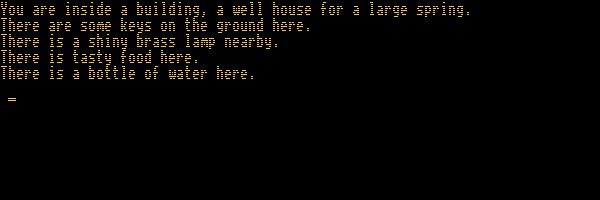
When I was first introduced to "video games," I started by playing this fantastic little game called "Apple Adventure." It was a text-based adventure game, where the user interacted with the computer by typing commands, and the computer would then narrate the story as the user explored the world around.

Apple Adventure
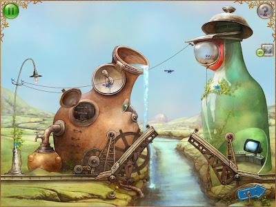
Later, I got into several other adventure games, such as the "Escape the Room" games, as well as "Myst." One of my most recent favorites was "Tiny Bang Story" by Colibri Games. I love the way it combines world exploration with object hunting and puzzle solving. 

Tiny Bang Story
In drawing upon some of these as inspiration, last year I came up with the idea to have a word-based adventure game similar to "Apple Adventure," but utilize voice recognition instead of typing. This would allow the user to "play" such a game while driving. Imagine how much fun road trips could be!

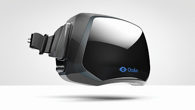
Oculus Rift
More recently, though, with the invention of the Oculus Rift, I think this could be taken to a much higher level of gameplay. The story could begin similarly, with nothing showing on the screen, the story narrated to you as you interact verbally with the technology, giving commands to "explore" the area until you are able to light the scene. Once the visual dynamic kicks in, the game takes off! Exploration because multi-sensory. You can now walk around and find things to use along your journey. When combined with a gameplay glove (do these exist yet?), there could be things like a combination lock that you actually twist and turn to open, weapons you have to find to fight potential enemies, maybe directions to create some witches' brew...the ideas keep coming. What do you think, does an interactive adventure game hold any intrigue for you?

Monday, April 22, 2013

Comic Book, Pt. 1

As a personal side project this semester, I will also be developing my own app with the intent of distributing a comic book. It will be an iOS native app. Without getting too much into the nitty gritty of the book, I have put together two simple prototypes to consider as interface alternatives. The comic book will initially only include one "book" (episode/chapter...still working on terminology), so further versions will need to include capability for multiple book navigation. The MVP, however, will start with a splash screen, enter right into the first page of the book, and have a way to move from scene to scene. The main differences between the two prototypes, however, is in the main navigation. If a user decides to exit the page view, they will be presented a way in which they may skip to alternate pages. These differences will be outlined in greater detail below.


The first version begins with a splash screen to be viewed during loading. I am still debating whether or not to include a progress indicator for this activity. Because the app is loading photos, the build could take a while, and the user should be notified the app is still functioning. On the other hand, I do not want the progress bar to take away from the comic book feel of the app. There are several progress indicators with a tech-y feel that might transition nicely, so...that decision will remain pending.


Once the program has loaded, the user will be directly presented the first page of the book. "Page turn" indicators in the bottom corners will indicate tap areas to navigate forward and backward through the book. There will also be a "home" button in the top, which will allow the user to access the main navigation mentioned earlier.


The main navigation will be presented in a grid view, just like a standard photo album. This will allow the user to skip forward or backward to view a different part of the book. Once clicked, the user will be taken back into page view as seen above.


The second version also starts with a standard splash screen while the program loads. That is then followed by a similar page view, but the "page turn" indicators have been left out in favor of a swipe navigation between pages, with a page turn animation instead. Also, the "home" button has been switched to a "close" button in the top right corner. Finally, the main navigation is presented in a carousel format.


These two paper prototypes will be used this week for testing as follows:

Goals
-Are "page turn" indicators necessary?
-Is a progress indicator necessary?
-Which navigation style is preferred?

Participants
I intend to obtain feedback from 25+ potential users. I will begin by testing the others on the comic book committee (3 individuals) as well several of my easily contacted friends (8 individuals). I will augment those numbers with other individuals from my classes and environment as well. I intend to have all data obtained by Wednesday.

Method/Tasks
I will first give the test subject a short introduction to the process the test, then flip a coin to determine which version will be presented first. I will then present the first splash screen to the individual and start a timer. I anticipate the user will tap the splash screen once. After that, I will stop the timer upon their next action, as this action will most likely be out of frustration rather than expectation. I will simultaneously present them with the next page, which is the first screen of the book. I anticipate those with the "page turn" indicators presented first will immediately try to use those, but when presented with the other interface will have a little more difficulty transitioning to swipe movements. I will have two or three additional "book pages" prepared for the user to navigate through, and will run through the experiment until the user decides to quit. 

Upon completion, I will ask the user the following three questions:
-Which style of navigation did you prefer (carousel/grid)?
-Which method of turning pages did you prefer (swipe/tap)?
-Did the "page turn" indicators augment your user experience?

Measures
The timing of the initial sequence will later be compared to actual load times to determine whether or not a progress indicator is necessary. The user comments will also be taken into consideration and tested at a 90% confidence interval. I also will need to put both prototypes on the same color of paper so that does not influence their decision. 

Stay tuned to find out what comes of the experimentation!

Sunday, April 21, 2013

Implementation, Pt. 2

After an in-depth discussion with our instructor, we boiled our project down to the absolute essentials we need to include in our MVP, and we decided the best route to go for now is to simply build an app where users can read jokes. We will postpone implementing any user submissions, marking favorites, etc. for future versions. As such, we also decided to develop two versions of our interface. Our first version opens each new joke into a separate screen. Here are pictures of the landing page as well as the first joke opened.
Version 1, Home Screen

Version 1, Joke 1
For our second version, we decided to test a collapsible list (that's the term used by jQuery Mobile, while 4ourth Mobile uses the term "windowshade"). Here is a screenshot demonstrating two jokes open simultaneously.
Version 2
User testing will begin shortly on these two different versions, followed by more detailed CSS designing to implement different visual elements.

Show Me More

In a return glimpse at possible designs this week, we take a look at ways of displaying more information to the user, as outlined by 4ourth Mobile Design in the chapter "Revealing More Information". The common theme behind this section is revealing additional information on the same screen where the user is already working rather than taking the user to a new screen. This can be done in several ways. The first is a simple pop-up. Apple uses this design a lot to confirm actions before proceeding. Here, the app Bump uses a pop-up menu, which populates the screen from the bottom:

Bump
Another popular method is to employ a windowshade concept where information spreads, revealing information in a way that it seems as though the window shades have been drawn, granting access to information previously hidden behind them. Here are two examples of the pattern from the iPhone's Weather app as well as their home screen menu:
Weather
Home Screen
Unfortunately, as you can see, sometimes the revealing of information distorts an otherwise adorable photo. Maybe it would be better to employ this as a pop-up, thus covering a portion of a photo rather than slicing it into pieces. What do you think?

Wednesday, April 10, 2013

Implementation, Pt. 1

After Martin and I got together and reviewed our four prototypes, I sat down and started building the project. This week I was able to put together the main navigation. Although we decided we would prefer to have filmstrip navigation, I have not yet been able to figure out how to implement that, so I went with a menu bar across the top. We are using jQuery Mobile to put the project together, which utilizes basic HTML/CSS to build a web app. For anyone interested in seeing the preliminary implementation, it is currently being hosted here. Stay tuned for more information as the project progresses!